Monday, April 25, 2016

Practical Exploration- Final Idea and Evaluation

For me personally,  I would say this module has been difficult a bit. I really enjoyed the practical side of making a tea packaging, but it was a bit difficult for me to write an essay as English is not my first language. If I'm honest, I did not engage with Context of Practice as much as I have with Studio Practice for example. This is simply because it is much more of a formal. At the beginning I am not pleased to say that although I did try up to date which was very hard and I was brushed under the rug this module too much. When it came to practical exploration I felt really behind as I was living things to the last moment. I fell if I would have started doing my Practical Exploration earlier I could come up with more interesting ideas so my blog would not be limited as much as is now. 

Writing my essay was quite challenging for me as I said before English is not my first language, so it took me a while to get in to. However when I have started going in to my essay question I have become increasingly more interesting and I was really enjoying it as I am passionate about everything which is related to branding. During writing my essay I have learnt a lot of new things especially the ways of manipulations of brands and commercials. I fell I have produced a good essay which links well to my practical work. 

I have really enjoyed the practical side of this module. Although it took me a while to decide on a firm idea mainly because I had a lot of different ideas so I wasn't quite sure which one to take. I do feel I have produced an appropriate and strong response to this brief. Also I feel the message is appropriate response to the themes in my written piece. It would be beneficial if I would try to use different illustrations and experiment a bit with them, but I feel pleased with what I have produce. 

In the next year I would try to be more engaged with the Context of Practise as I said it is very important module as well as the other ones. I would try to keep my work up to date and do not leave things to the last moment. 


Wednesday, April 20, 2016

Practical Exploration - Box

I have designed a packings using the tea box template. The design would be printed on thick paper.


Practical Exploration - Box Research

On the end, after designing everything I need to chose the material of the both packagings.
As one of the packages is going to be more expensive than the other one I thought about using a can and for the cheaper one I would make it with normal thick paper.

Examples of can packaging:


Examples of paper packaging:


Practical Exploration - Tea Sachets

I have designed 2 sachets for my tea bags. I think it looks really good. I will use them for my final design.


Practical Exploration - Research of Tea Sachets

I need to design some tea sachets as well. Before doing it I did a bit of research how real tea sachets looks like and what information I need to put. By researching it, it have me an idea of outing a logo and the same design as I will have on my packaging. On the back of the sachets I would put how information to make a tea in the same way as I did for the back of the packaging. 


Practical Exploration - Tea Tags - Designs

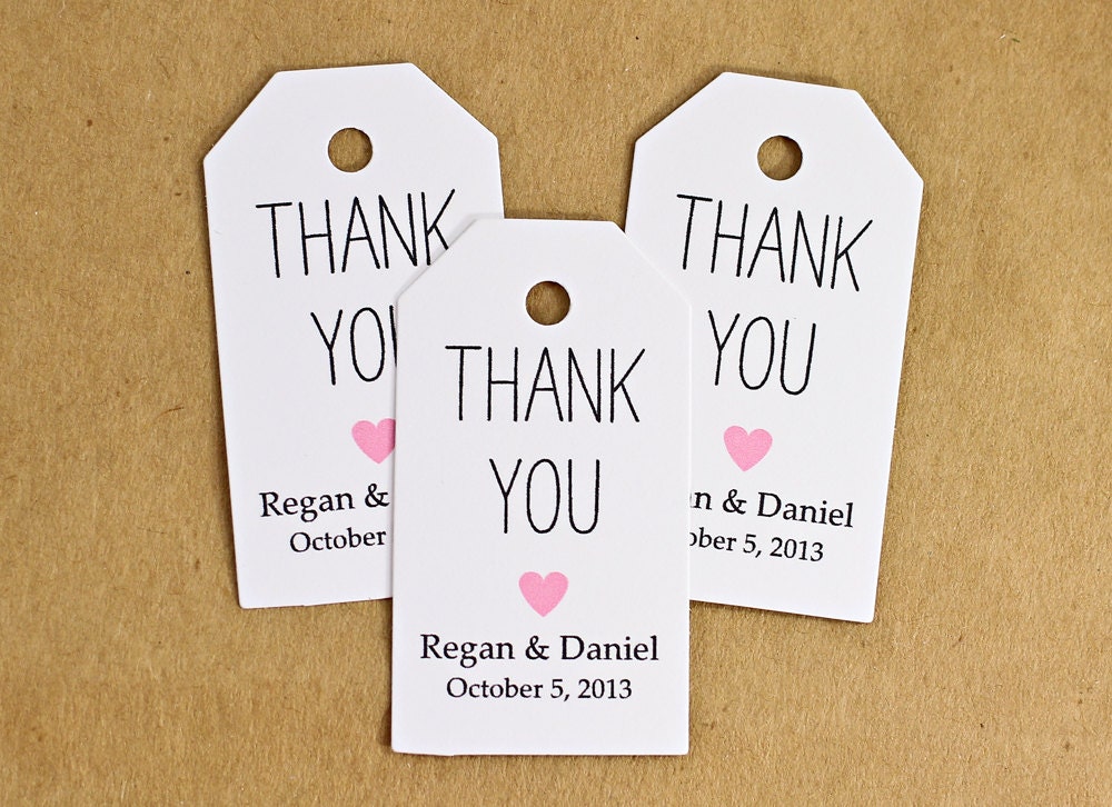
Taking inspiration from the research I have designed my own tea tags. I think they come up really good but I am still not sure about which colour would suit my packaging more.


Tuesday, April 19, 2016

Practical Exploration - Research of Tea Tags

My next step was to make some tea tags. I have started by researching already existing tea tags to get a better understanding how it supposed to look like. I have found that some of them are using different quotes, the tea brand logo, illustrations and text. I really like the idea of using quotes for tea tags. I have catch my self couple of times just reading what it says on the tea tag.


Practical Exploration - Front and Back - Ideas

Using my sketches and images from internet I have done initial ideas for my tea packaging. I love those ideas, they perfectly show what I wanted to achieve.


I feel a bit no sure about the first design with the roses as it makes me feel like it is a design for the soap packaging. I have decided to look at different illustrations of roses and to play a bit with it.


I have designed the back of the packaging as well. I have used the information how to make a tea. I think it looks really good and showing what I wanted achieve for it.


Practical Exploration - Research of Packaging

As my teas are flavoured I need to make my packaging designs suitable for the theme.
The first packaging is about rose tea so I need to use some roses illustrations as a design for it.
I have looked at different illustrations to get some inspiration for my designs. I really like those illustrations I think I would draw some roses or maybe take some photos of them.


I have done couple sketches of flowers which I am going to use for my tea packaging.


Moreover I need to design the back of the packaging as well. I have done a bit of research to find out what kind of information I need to use for it. I took couple of photographs of my teas. The teas has different information on the back of them such us: how to make a tea, history of the brand, the ingredients and a bit of information about a tea. As I have created a new brand I don't have any history of it I am thinking about using a little information how to make a tea for the back of it. 


Practical Exploration - Logo

I thought about 3 different names which I can use for the name of tea brand.

- Chill Out Tea
- Czillmach
- Aura

I really like the first one one 'Chill Out Tea' because looking at the name of it, it symbolise relax and rest. I want to keep the name simple, clear and short. I have done couple of possible ideas for the symbol and logo. I have looked only at thin typeface as the bold one would not suit the theme.
For the logo I have used tea leaf as I think appropriate one.

The font which I had chose for my logo is Century Gothic, I had to chose lower cases as doing it in capital cases would not suit the symbol and the meaning of it. Doing it in capital letters would look like someone is 'shouting' so it wouldn't suit my theme.


I am also thinking about creating 2 different teas Rose and Camomile. I have done digital ideas for the label. I want to make them in white and black as the illustrations of the flowers would be colourful.


I really like the outcome of them, I would use it as a final logo for my packaging. I feel I have chose appropriate font as it suits the world 'chill out'.  The font which I had chose for 'Rose' and 'Camomile' is Mirella Script. 


Practical Exploration - Research of Tea Brands

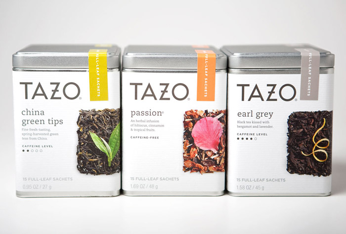
I have done a bit of research of the most known tea brands, to look at theirs names and packaging designs. I have found a web page of the favourite brands of tea, ranked from best to worst.
Page link: http://www.telegraph.co.uk/food-and-drink/drinks/10-of-britains-favourite-brands-of-tea-ranked-from-best--to-wors/

The best ranked tea is Yorkshire tea, Clipper and Twinings and the worst one is Lipton


The worst ranked one:


I have also looked at luxurious branding of packagings, personal branding etc. to see what is the difference between them and what they have in common. Also what type face and designs they all use to give off the better impression. The only difference between those two products is just slightly difference quality. Looking at the luxury packaging makes people feel that the product is better quality one than the cheaper one. This example shows how branding can trick and manipulate with people. This lead to make people buying a product which is not necessary to buy.


Luxury Packaging


Basic Packaging